Ever since mobile internet traffic surpassed web in 2014, it has continue to grow strong.
This shift has driven user interface designers to prioritize mobile over web as well. In designing for mobile, it’s important to consider how mobile users hold their gadgets, and where on the screen their fingers will conveniently reach.
Furthermore, the variety of gadget sizes affects how each device is held, and therefore what parts of the screen are easily accessible to the user. Thus, each type of device has its own UI design needs.
Although different devices vary greatly in how they are used, they share a common trait: most of their use is with thumbs. This similarity helps designers establish guidelines that create consistency throughout different versions of the interface. It’s important for designers to keep in mind certain rules of thumb when designing for screens of different sizes.
Smartphones
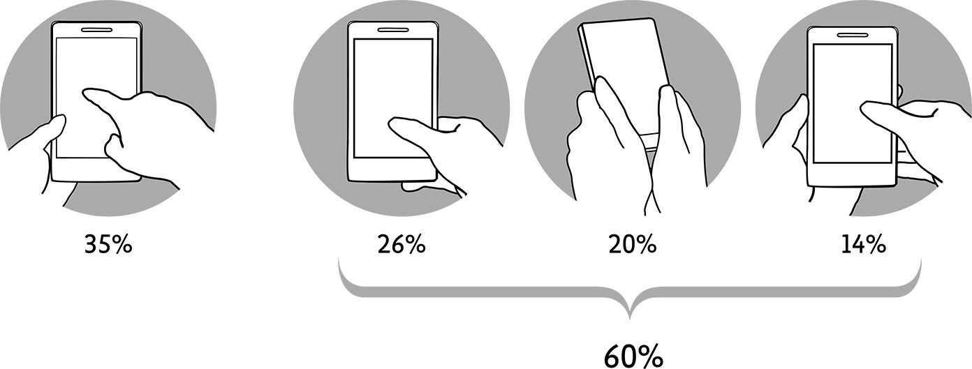
Smartphones are undoubtedly the most used gadgets. Research shows that the average smartphone user checks their phone before even getting out of bed, and does so over 200 times throughout the day. The ways users hold their phones is fairly predictable: most use one of three common grips. Close to half of users, 49%, hold and use their phones with one hand; 36% hold their phone with one hand and use the other to tap the screen; while the remaining 15% hold the phone with both hands and type with both thumbs.
Users also switch between different grips depending on what they’re doing and which is most convenient. Studies have also found that people tend to be more ambidextrous with their phones: 67% of one-handed use is right-handed, while only 10% of people are left-handed. Therefore, many people tend to use their non-dominant hand for their phone while doing something requiring more focus with the other.
Although people often change how they hold their phones, they show a distinct preference for thumbs over other fingers. This applies both to the one- and two-hand phone grips. Additionally, those who hold their phone with one hand but use the other on the screen also tend to prefer their thumbs. Combined, approximately 75% of phone interactions are thumb-based.
The Thumb Zone
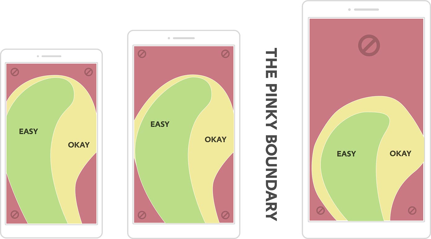
While the majority of a standard sized phone’s screen can be reached by the user’s thumb, only about a third of the screen is truly convenient to use. For a right-handed-only grip, this ideal zone ranges from the bottom left corner of the phone to the middle right area. With a two-handed grip, the ideal thumb zone is extended to the reach of both a right- and left-handed only grip. Accuracy is also factored in to the comfort of certain grips, and the the least accurate areas for right-handed users tend to be the bottom right and top right corners of the screen.
For left-handed users, the ideal thumb zone flips from left to right. However, this distinction isn’t crucial to UI design since, as we’ve seen, users tend to be fairly ambidextrous when it comes to using their phones. Even then, optimizing for one hand undermines those who use the other. The best way to solve this issue is to place the most important features in the middle of the screen, where the right- and left-hand zones coincide. Additionally, key features should not be placed near the top of the screen, as this is a stretch regardless of what phone grip is used.
Phablets
While the first few generations of smartphones were a convenient size to be used by only one hand, there has been a recent trend towards larger screen sizes. Devices such as the iPhone 6 Plus, the LG G4, and the Samsung Galaxy Note 4 all have screen sizes that fit in somewhere between a standard smartphone and a tablet.
Although phablets are much larger than phones, people tend to treat them more like phones than like tablets when in use. Phablet users do tend to switch grips more often, and use both hands to conveniently reach more of the screen more often than standard smartphone users. Research shows that phablet users tend to employ both hands 70% of the time, whereas both hands are used just about 50% of the time with smaller phones. However, just as with smartphones, phablet users tap with their thumbs more often than any other finger, about 60% of the time.
The Thumb Zone of the Phablet
The thumb zone is just as important for phablet users as regular smartphone users. Since phablet users use two thumbs more often, the optimal zone consists of a pair of mirrored thumb zones that overlap near the bottom of the screen. However, this creates a large area of inaccessible space near the top of the screen. Furthermore, even though the double thumb grip is the most commonly used one, UI designers shouldn’t optimize for it. A key rule of design is to accommodate for the most constricting situation, which in the case of a phablet, is the single hand grip. This way, users will be able to conveniently use the interface no matter how they hold their phone, and won’t be forced to adjust their grip.

Tablets
While hand grips for phones and phablets stay fairly predictable with three dominant options, there is no such pattern for tablets. The increased screen size means an increased number of ways to hold it. Tablet use also varies based on the user’s posture and position. Research has shown that almost 90% of tablet use is while sitting down, as compared to 19% of phone use. Typically, users use both hands for tablets, but the possibilities for various grips are endless. On top of various ways to hold them, tablets are usually held at different distances depending on the grip. The options of portrait versus landscape also don’t seem to have a clear pattern; portrait tends to be used about 60% of the time, which is only a marginal lead over landscape. Additionally, users are more likely to rest tablets on a flat surface, such a table or their lap, or a stand as the heavier device is less comfortable to hold for the entire time it is being used.
The Thumb Zone of the Tablet
When tablets are picked up rather than being propped up on something, they are far too bulky to be used with only one hand. Once again, thumbs play a key role as users tend to hold tablets from the sides, using their thumbs on the screen, generally closer to the middle or top of the screen. Thus, the top and bottom edges of the tablet are most inconvenient to reach, since those require the user moving his/her entire arm to reach.

Although different-sized screens have their specific target zones for UI design, users of all different gadgets prefer using their thumbs for tapping the screen. Thumbs provide the greatest range of motion with the least possible effort. UI designers should always accommodate for this minimal effort in creating interfaces for various mobile devices.


Are you looking for effective online promotion that delivers real results? I apologize for sending you this message on your contact form but actually that’s exactly where I wanted to make my point. We can send your advertising message to sites via their contact pages just like you’re getting this message right now. You can target by keyword or just fire off mass blasts to sites in the country of your choice. So let’s assume you need to send a message to all the web developers in the United States, we’ll scrape websites for only those and post your ad message to them. Providing you’re promoting a product or service that’s relevant to that niche then you’ll be blessed with an awesome result!
Send a quick message to [email protected] to get details about how we do this
Add to this that just about 30% felt that Fitbit was an enemy and made them really feel responsible, and instantly this expertise does not appear so good.